
How to Decorate a Bedroom with Designer Color Palettes
A beautiful bedroom rarely comes down to one perfect paint color. What makes a room feel polished is the way several colors work together—on the walls, bedding, furniture, window treatments, rugs, and smaller decorative accents. A thoughtful palette can make a bedroom feel warmer, brighter, calmer, richer, or even more sophisticated without requiring a complete renovation.
The good news is that you don’t need a professional interior designer to create that effect. The trick is learning how to build a palette with intention rather than choosing individual colors one at a time.
Think about the bedrooms that immediately catch your attention on Pinterest. They often have something in common: the colors feel connected. A warm neutral wall might repeat subtly in the bedding, while muted green appears in a throw pillow and artwork. Wood tones add warmth, and a darker accent gives the room enough contrast to keep everything from feeling flat.
In my experience, the easiest way to achieve this look is to start with three basic color roles: a dominant color, a supporting color, and an accent shade. From there, textures and materials bring the palette to life.
Whether you’re decorating a primary bedroom, guest room, apartment bedroom, or small space, the ideas below will help you choose colors that feel intentional and livable. You’ll also find practical guidance for coordinating paint, furniture, bedding, lighting, artwork, and accessories so your finished bedroom feels layered rather than overly matched.
Table of Contents
1. Warm Neutral Layers
Build a calming foundation with ivory, beige, taupe, and warm wood tones.
2. Soft Sage Accents
Use muted green to introduce a relaxed, nature-inspired feeling.
3. Moody Blue Contrast
Create a sophisticated retreat with deep blue balanced by lighter tones.
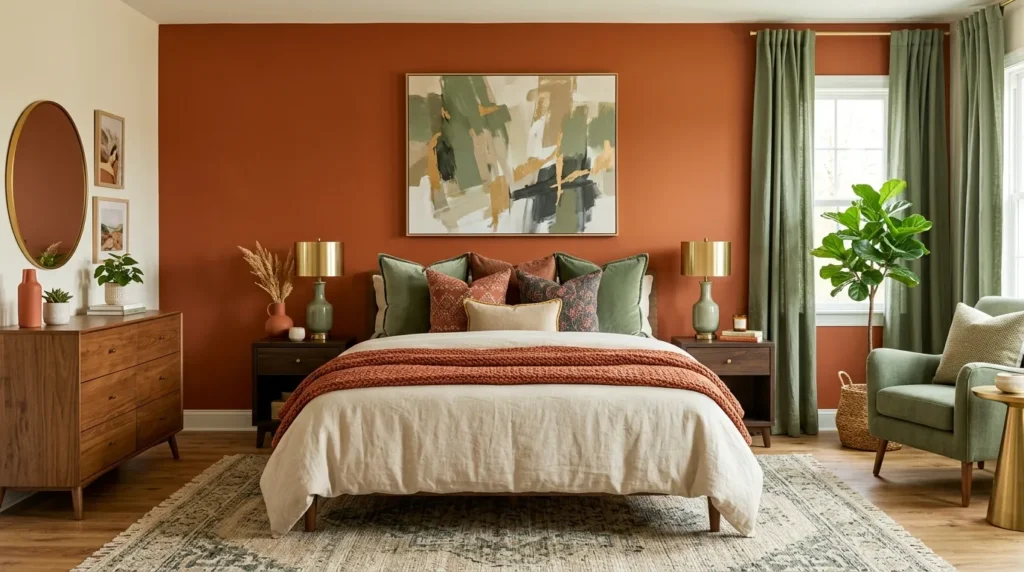
4. Blush And Terracotta
Combine gentle pink with earthy warmth for an inviting bedroom palette.
5. Cream And Charcoal
Pair soft creamy neutrals with charcoal accents for modern contrast.
6. Earthy Olive Tones
Bring depth and organic character into the bedroom with olive and natural materials.
7. Dusty Blue Layers
Create a peaceful, airy palette using faded blue and understated neutrals.
8. Chocolate Brown Accents
Add richness and warmth through brown furniture, textiles, and decorative details.
9. Layered Monochrome
Use several shades of one color to create a sophisticated, cohesive room.
10. Warm White Foundation
Let warm white provide a flexible backdrop for carefully chosen accent colors.
11. Designer Color Balance
Bring the entire palette together using proportion, repetition, contrast, and texture.
1. Warm Neutral Layers
Quick Benefits
- Creates a relaxed and timeless atmosphere
- Works beautifully with natural wood
- Makes bedding feel especially inviting
- Easy to update seasonally
- Suitable for small and large bedrooms
Why It Works
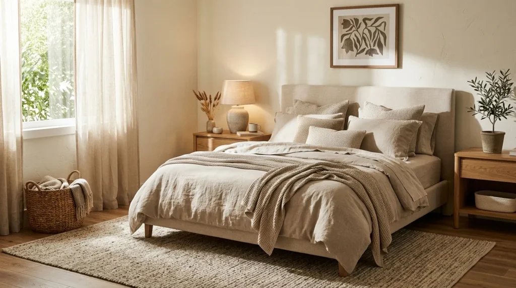
Warm neutrals are one of the easiest ways to make a bedroom feel polished without making it look overly decorated. Shades such as ivory, oatmeal, sand, beige, camel, and soft taupe have enough variation to create depth while maintaining a calm visual flow. Unlike a room built around one flat neutral, layered tones give the eye subtle changes to notice.
The key is temperature. Warm neutrals generally pair better with creamy whites, natural wood, aged brass, and earthy textiles than with icy gray or stark white. This combination creates the comfortable quality many people want in a bedroom. It also gives you flexibility because almost any muted accent color can be introduced later.
How To Style It
Start with a warm off-white or light beige wall color. Add an upholstered bed in cream, oatmeal, or natural linen, then layer bedding in slightly different shades rather than buying everything from the same color family. A camel throw or taupe lumbar pillow can create gentle contrast.
Bring in a natural wood nightstand, woven basket, jute rug, or cane accent to add texture. Keep window treatments soft and uncomplicated. For lighting, look for warm-toned bulbs and fixtures in brushed brass, bronze, or ceramic.
If the room begins feeling too beige, introduce one darker element such as a walnut bench, charcoal frame, or medium-brown accent pillow. That small contrast keeps a neutral bedroom from looking washed out.
2. Soft Sage Accents
Quick Benefits
- Adds a natural feeling without overwhelming the room
- Works well with cream and beige
- Creates a relaxed bedroom atmosphere
- Complements natural wood
- Easy to introduce through accessories
Why It Works
Soft sage is especially effective when you want color without creating a visually loud bedroom. Its muted green quality connects naturally with botanical tones, making it feel restful and grounded. Because sage is softer than saturated green, it can be used on larger surfaces while still maintaining a quiet mood.
The color also works across several decorating styles, including modern, Scandinavian, cottage, organic modern, and transitional bedrooms. The secret is choosing a dusty or gray-green version rather than an extremely bright green. Pairing sage with creamy neutrals makes the color feel sophisticated rather than trendy.
I’ve noticed that sage becomes particularly beautiful when the room includes natural textures. Linen, oak, rattan, wool, and woven materials help reinforce its organic character.
How To Style It
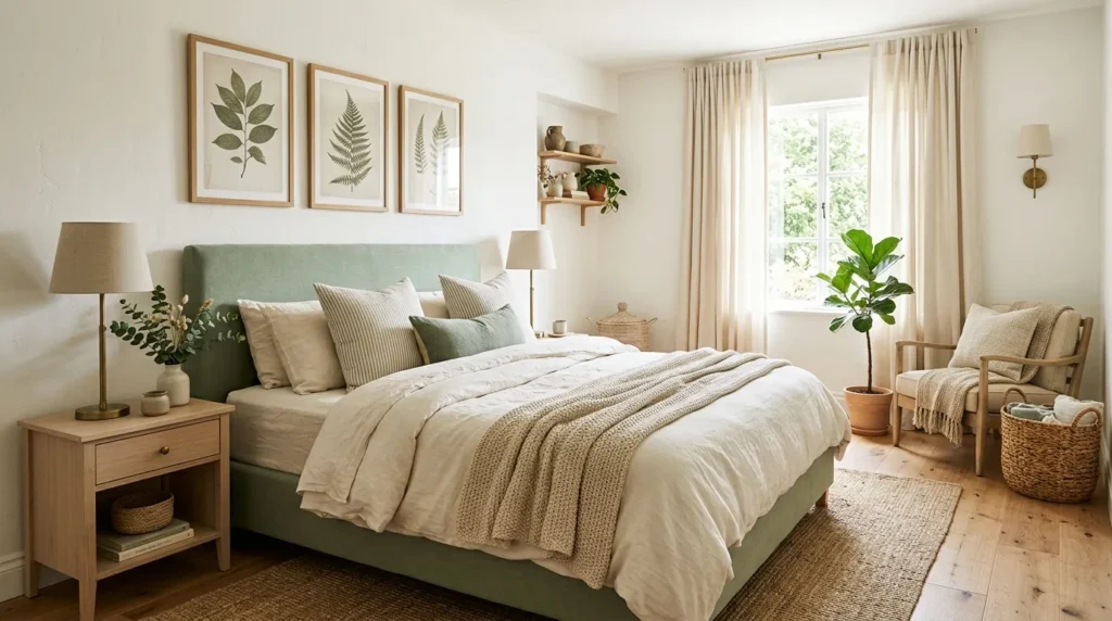
For a subtle approach, keep the walls warm white and use sage through the bedding, curtains, artwork, or accent chair. A sage quilt paired with cream sheets can create enough color without making the entire room green.
For a stronger statement, consider sage walls with a lighter upholstered bed. Keep the furniture relatively simple so the wall color remains part of the overall composition.
Add natural oak nightstands, woven baskets, ceramic lamps, and botanical artwork. A small amount of muted brass can provide warmth. Avoid introducing too many competing accent colors. Cream, tan, soft brown, and muted black are usually enough to complete the palette.
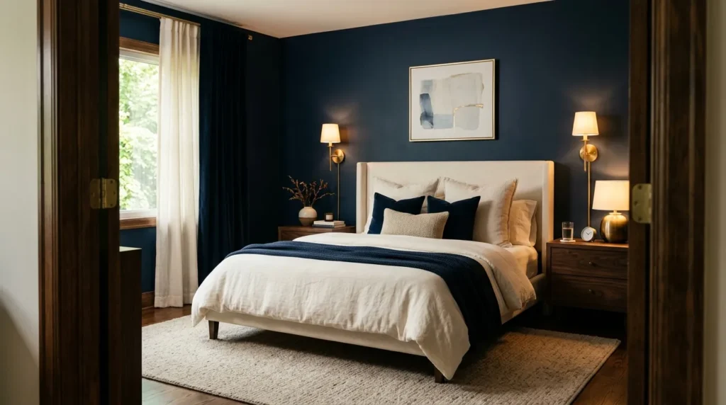
3. Moody Blue Contrast
Quick Benefits
- Creates a sophisticated bedroom atmosphere
- Adds visual depth
- Works well in larger rooms
- Pairs beautifully with warm neutrals
- Can make simple furniture feel more dramatic
Why It Works
Deep blue can completely change the personality of a bedroom. Navy, slate, ink, and muted blue-gray shades create depth and make a room feel intentionally designed. Although dark colors can seem intimidating, they can actually make a bedroom feel more intimate when balanced with lighter textiles and thoughtful lighting.
The most important consideration is contrast. A deep blue wall needs enough visual relief around it so the room doesn’t become heavy. Cream bedding, pale wood, brass lighting, or lighter rugs can provide that balance.
Moody blue also works particularly well in bedrooms because its visual richness feels appropriate for a restful space. Instead of treating the dark color as something to be afraid of, think of it as an architectural backdrop.
How To Style It
Try using deep navy or blue-gray on one accent wall behind the bed, especially if you’re not ready to commit to four dark walls. Alternatively, paint the entire room and use cream-colored bedding to create contrast.
Choose furniture in walnut, medium oak, black, or upholstered neutral fabric. Layer the bed with white or ivory sheets, a blue-gray duvet, and one or two patterned pillows.
For accessories, aged brass lighting and framed artwork with cream or tan backgrounds work beautifully. Add a soft rug beneath the bed to break up the darker palette. Warm bedside lamps are particularly helpful because they soften the overall effect at night.
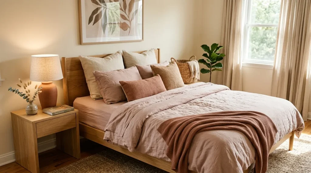
4. Blush And Terracotta
Quick Benefits
- Adds warmth without feeling overly bright
- Creates a romantic but grown-up look
- Works beautifully with beige
- Adds personality to neutral bedrooms
- Easy to adjust seasonally
Why It Works
Blush and terracotta create an unexpectedly sophisticated pairing because they share warm undertones while offering different levels of intensity. Blush provides softness, while terracotta contributes earthy depth. Together, they can make a bedroom feel welcoming, layered, and comfortable.
The trick is choosing muted versions of both colors. Dusty rose generally feels more sophisticated than bubblegum pink, while clay or muted terracotta works better than highly saturated orange.
This palette is especially effective when paired with warm ivory, natural wood, linen, and aged metal. The result feels colorful but grounded. It also gives you plenty of opportunities to introduce small decorative details without making the room feel busy.
How To Style It
Keep the foundation simple with warm white, ivory, or light beige walls. Add blush through a quilt, pillowcases, artwork, or a small upholstered bench. Introduce terracotta in a lumbar pillow, ceramic vase, throw, or patterned rug.
Natural oak or walnut furniture works well with these colors. For bedding, combine cream sheets with a dusty rose coverlet and a terracotta accent pillow rather than using both colors equally.
Complete the room with warm lighting, woven textures, and a few handmade-looking ceramic pieces. If the palette feels too warm, introduce a small amount of muted olive or soft gray-green through artwork or a plant.
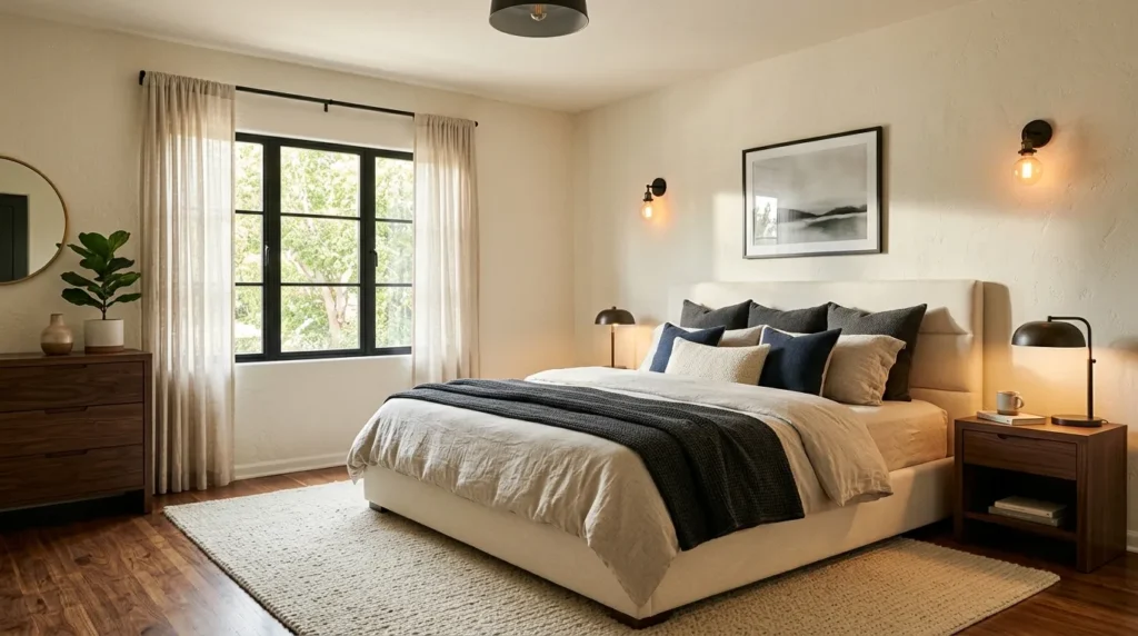
5. Cream And Charcoal
Quick Benefits
- Creates clean modern contrast
- Keeps the bedroom visually calm
- Works with contemporary furniture
- Easy to accessorize
- Looks sophisticated without being formal
Why It Works
Cream and charcoal create a softer alternative to a traditional black-and-white bedroom. Cream provides warmth and comfort, while charcoal introduces definition. The contrast is strong enough to make furniture and architectural features stand out, but the warmer base prevents the room from feeling cold.
This palette works particularly well in modern bedrooms where clean lines are important. It also gives you a simple framework for mixing materials. Wood, linen, metal, glass, and stone can all sit comfortably within the same color story.
A common mistake many homeowners make is using too much dark gray. The goal is not to divide the room into equal amounts of light and dark. Instead, let cream dominate and use charcoal strategically.
How To Style It
Use warm white or creamy walls as the primary backdrop. Choose bedding in ivory, oatmeal, or soft beige, then add charcoal through the headboard, throw, cushions, artwork frames, or bedside lamps.
Blackened metal can provide a slightly sharper version of the charcoal accent, while walnut furniture keeps the room warm. Consider a textured cream rug rather than a stark white one because it will be more forgiving in everyday use.
Repeat charcoal in several small areas instead of concentrating it in one place. For example, use a charcoal throw, dark picture frame, and black metal lamp. These repeated accents help the bedroom feel cohesive.
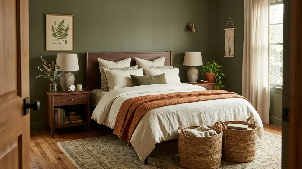
6. Earthy Olive Tones
Quick Benefits
- Adds rich natural color
- Creates a grounded atmosphere
- Works with warm wood
- Complements cream and beige
- Suitable for rustic and modern styles
Why It Works
Olive is deeper and earthier than sage, making it ideal when you want a bedroom palette with more visual weight. It has a natural quality that works beautifully with wood, woven fibers, stone, and aged metals.
Because olive can contain both yellow and gray undertones, it is important to consider the exact shade before committing to paint or large furniture. A muted olive usually feels easier to live with than an intense yellow-green.
The palette becomes particularly attractive when olive is used as a supporting color rather than the only color in the room. Cream, camel, walnut, and soft black provide enough variation to make the green feel intentional.
How To Style It
Use olive on an accent wall, upholstered headboard, curtains, or bedding. If you choose olive walls, balance them with cream bedding and medium or light wood furniture.
For a lighter approach, use an ivory bedroom foundation and bring olive in through pillows, a quilt, artwork, and plants. Add camel leather or woven accessories to emphasize the earthy quality.
A vintage-style rug with muted olive, beige, and brown can connect all the colors. Finish with aged brass or bronze lighting rather than very shiny chrome. The goal is a bedroom that feels collected and natural rather than perfectly coordinated.
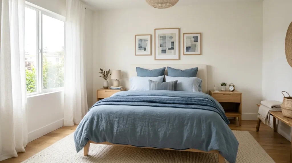
7. Dusty Blue Layers
Quick Benefits
- Creates a peaceful atmosphere
- Works especially well with white and cream
- Adds color without visual heaviness
- Complements traditional and modern bedrooms
- Easy to layer through textiles
Why It Works
Dusty blue is one of those colors that can feel both fresh and established. Its muted quality makes it easy to combine with cream, warm white, light gray, pale wood, and natural fabrics. Rather than demanding attention, it quietly changes the mood of the room.
Layering different blue values creates more sophistication than choosing one matching shade for everything. A faded blue duvet, slightly deeper pillow, and blue-gray artwork can create movement while maintaining harmony.
This palette is particularly useful if you want a colorful bedroom that still feels restful. It provides personality without the visual intensity of brighter jewel tones.
How To Style It
Begin with warm white walls and neutral flooring. Choose a dusty blue quilt or duvet as the primary color moment. Add one deeper blue pillow and a small amount of blue-gray through artwork or curtains.
White oak, painted cream, or light walnut furniture can all work. For texture, introduce linen bedding, a woven rug, cotton curtains, and a soft upholstered bench.
If you want more warmth, add camel or tan in small amounts. A leather handle on a nightstand, tan throw pillow, or natural wood frame can keep the palette from feeling too cool.
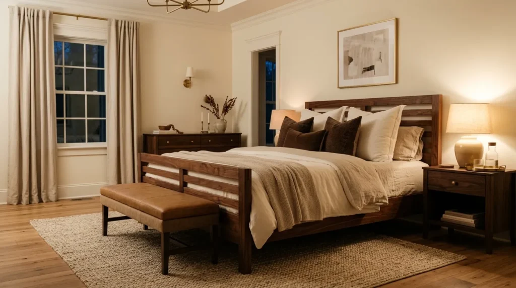
8. Chocolate Brown Accents
Quick Benefits
- Adds warmth and depth
- Works beautifully with cream
- Makes a room feel grounded
- Complements wood furniture
- Creates a cozy, upscale feeling
Why It Works
Brown has returned as a favorite decorating color because it provides warmth that many cooler neutrals cannot. Chocolate brown, espresso, cocoa, and walnut tones can make a bedroom feel rich without relying on bright color.
The most successful approach is to combine several brown values instead of using one exact shade throughout. A walnut nightstand, cocoa throw, tan rug, and cream bedding create a much more interesting composition than matching brown accessories.
Brown also works well with natural materials because it already resembles the colors found in wood, leather, clay, and woven fibers. That makes it an easy bridge between furniture and textiles.
How To Style It
Keep the walls warm white, creamy beige, or pale taupe. Introduce chocolate brown through a bed frame, bench, blanket, accent chair, or decorative pillows.
Layer cream and oatmeal bedding over a darker wood bed. Add a textured rug with beige and brown variation. If the room needs more color, muted olive, dusty blue, or terracotta can work as secondary accents.
Use warm lighting to emphasize the richness of the brown tones. Ceramic table lamps, linen shades, and aged metal details can make the palette feel relaxed rather than overly formal.
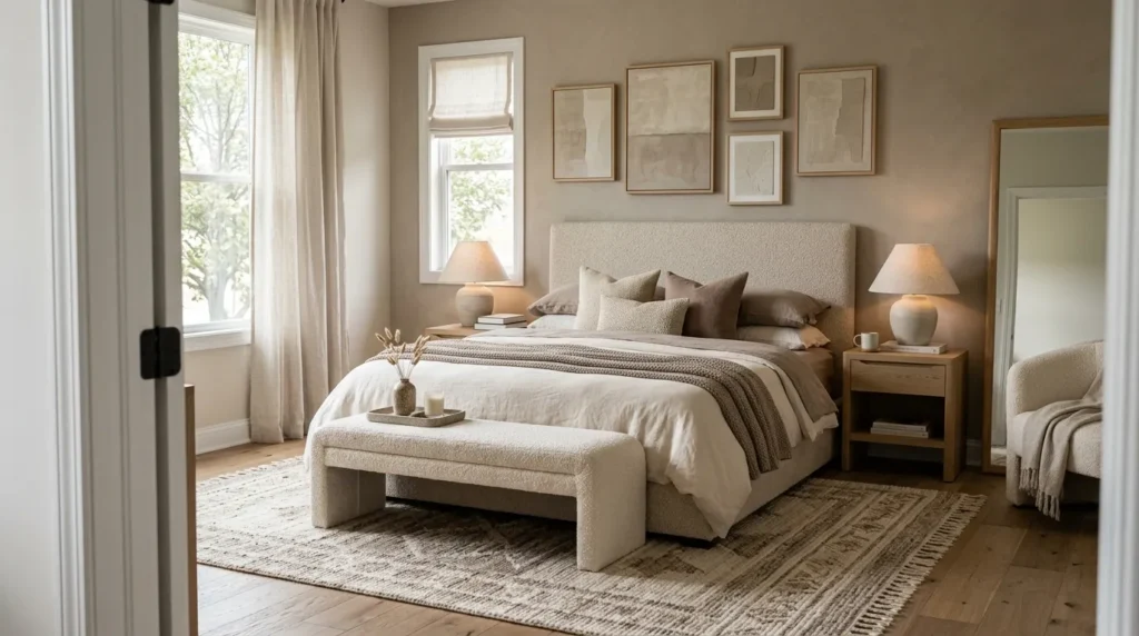
9. Layered Monochrome
Quick Benefits
- Creates a cohesive designer appearance
- Simplifies color selection
- Works in small bedrooms
- Makes texture more important
- Easy to personalize
Why It Works
A monochromatic bedroom doesn’t have to mean using exactly one color. The more sophisticated approach is to choose one color family and build the room from several lighter and darker versions of it.
For example, a beige monochromatic room might include cream, oatmeal, sand, taupe, and camel. A blue version could combine pale blue, dusty blue, slate, and navy. The repetition creates cohesion while the changes in value prevent the room from looking flat.
Texture becomes especially important because there are fewer color changes to create visual interest. Linen, boucle, velvet, wool, wood, and woven materials can all provide contrast without disrupting the palette.
How To Style It
Choose one dominant color family first. Then select a light version for the walls, a medium shade for the bedding, and a deeper shade for smaller accents.
For a taupe bedroom, for example, pair creamy taupe walls with oatmeal bedding, mushroom-colored pillows, and a darker brown throw. Add a natural wood nightstand to introduce material variation.
Avoid buying every accessory from one store or in one matching set. A monochromatic room looks more sophisticated when the pieces have different textures and shapes. Let the color connect them rather than making every item identical.
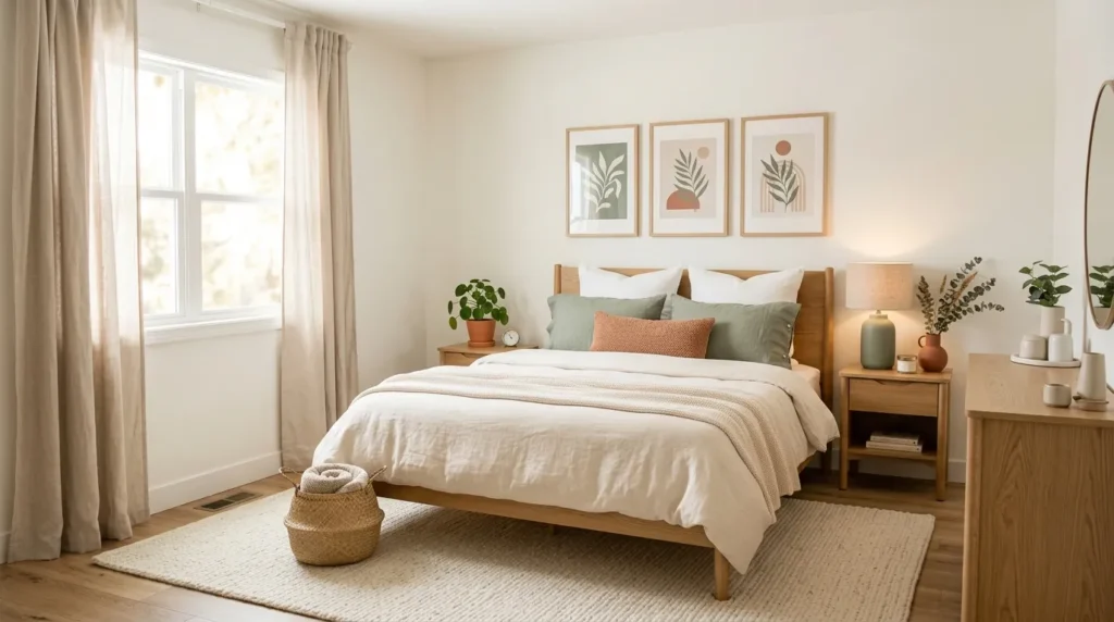
10. Warm White Foundation
Quick Benefits
- Makes bedrooms feel bright and spacious
- Provides maximum decorating flexibility
- Works with almost every accent color
- Helps natural light feel softer
- Easy to refresh over time
Why It Works
Warm white is one of the most useful foundations for a bedroom because it creates brightness without the starkness that some cool whites can produce. It reflects natural light while maintaining a comfortable appearance, particularly when combined with cream textiles and warm wood.
The important detail is choosing a white with an appropriate undertone. Some whites lean yellow, some pink, some gray, and some neutral. Always test paint samples in the actual bedroom because natural and artificial lighting can change how the color appears.
A warm white backdrop also allows you to change accent colors over time without repainting the entire room.
How To Style It
Use warm white on the walls and ceiling, then create the color story through bedding, furniture, artwork, and accessories. For example, a cream foundation could support sage green, dusty blue, terracotta, or chocolate brown.
Layer different whites instead of trying to make every white identical. Ivory linen, cream boucle, soft white cotton, and warm beige can look beautiful together.
Add wood furniture for warmth and use artwork to introduce one or two stronger colors. If you’re decorating a rental, this approach is particularly practical because removable textiles and accessories can completely change the palette without permanent alterations.
11. Designer Color Balance
Quick Benefits
- Prevents colors from competing
- Makes the room feel professionally coordinated
- Creates better visual rhythm
- Helps guide furniture and accessory choices
- Makes future decorating easier
Why It Works
The secret behind many successful bedroom palettes isn’t simply the colors themselves—it’s how much of each color appears. A beautiful combination can still feel chaotic if every shade receives equal visual weight.
A useful starting point is the 60-30-10 approach: roughly 60 percent dominant color, 30 percent secondary color, and 10 percent accent. This isn’t a strict decorating rule, but it provides a helpful framework.
For example, warm white might dominate the walls and bedding, natural wood and beige could provide the supporting tones, and muted sage could appear in small accents. The eye recognizes repetition, so repeating an accent color in at least three places usually helps the room feel connected.
How To Style It
Start by identifying the largest visual surfaces: walls, flooring, bed, curtains, and large furniture. Assign your dominant color to these areas. Next, choose a supporting shade for bedding layers, rugs, upholstery, or furniture.
Finally, select one accent color for smaller objects such as pillows, artwork, ceramics, lamps, or throws. Repeat the accent in different parts of the room rather than placing everything together.
Don’t forget about materials. A color can look completely different in velvet, linen, painted wood, ceramic, and metal. Mixing finishes gives the palette dimension.
Before buying anything else, stand at the bedroom entrance and look at the room as a whole. If one color immediately dominates your attention, reduce it or introduce more balance elsewhere.
Frequently Asked Questions
What is the best color palette for a bedroom?
The best bedroom palette depends on the mood you want to create. Warm neutrals are versatile and timeless, while sage, dusty blue, and muted earthy tones can add personality without overwhelming the room. Start with a dominant neutral, add one supporting color, and finish with a small accent shade.
How many colors should a bedroom have?
Three main colors are usually enough for a cohesive bedroom: one dominant color, one secondary color, and one accent. You can use several shades within those families. For example, cream, beige, and taupe can function as variations of a neutral palette rather than three unrelated colors.
Should bedroom walls match the bedding?
They don’t need to match exactly. In fact, using slightly different shades often creates a more layered and designer-like appearance. If your walls are warm white, for example, your bedding can include cream, oatmeal, beige, or a muted accent color.
How do I choose a bedroom color palette?
Start with something you already love, such as a rug, artwork, bedding fabric, or furniture finish. Pull two or three colors from that item and assign them different roles. Then test paint samples and fabrics in the actual room before making larger purchases.
What colors make a bedroom feel cozy?
Warm whites, beige, taupe, caramel, brown, muted terracotta, olive, and dusty rose can all create a cozy feeling. The effect also depends on lighting and texture. Soft textiles, layered bedding, rugs, curtains, and warm light often contribute as much to coziness as the colors themselves.
Are dark colors good for bedrooms?
Yes. Dark colors such as navy, charcoal, olive, and deep brown can create a dramatic and intimate atmosphere. Balance them with lighter bedding, reflective or warm lighting, and contrasting textures. In smaller bedrooms, using a dark color on one wall can provide the effect without making the entire space feel heavy.
How can I make a bedroom look more expensive with color?
Focus on coordination rather than adding more colors. Choose a restrained palette, repeat accent shades throughout the room, and combine different textures. Warm neutrals with wood, linen, aged metal, and one deeper accent often create a polished look without requiring expensive furniture.
Conclusion
A designer-looking bedroom isn’t necessarily built around expensive furniture or complicated decorating rules. More often, it comes from making thoughtful decisions about color, proportion, texture, and repetition.
Start with the feeling you want your bedroom to have. If you want calm and timeless, warm neutrals or layered monochrome may be the right direction. If you want more personality, sage, dusty blue, terracotta, or olive can add color while remaining livable. For a dramatic retreat, deep blue, charcoal, or chocolate brown can create beautiful depth.
The most important thing is to give every color a role. Let one shade dominate, allow another to support it, and use accents sparingly enough that they feel intentional. Then soften the palette with materials such as linen, wool, wood, rattan, ceramic, and woven fibers.
You also don’t have to finish everything in one weekend. Start with the bed and largest surfaces, live with the palette for a little while, and add accessories gradually. That slower approach often produces a bedroom that feels collected and personal rather than decorated all at once.
Choose one palette that speaks to you, test it in your actual lighting, and build from there. A few carefully chosen colors can completely change the way your bedroom feels every day.